Our Name

Reinforcing a national brand requires that we treat our brand name respectfully and consistently. We must all use the same prescribed logo and we must all use the newly merged, single name “Easterseals.”


Should We Capitalize the Name?
For the logo, we deliberately chose a friendly, approachable lowercase “e” to begin our name. When writing about the organization, we have decided to treat “Easterseals” as a proper name and capitalize it in every instance.
Our Logo

Easterseals brings support—and hope and joy—into people’s lives—including a diverse community of volunteers, families and caregivers. Our work is infused with optimism—striving towards our full potential. It inspired our logo, which projects a burst of sunshine, rays of hope, and the support of an entire community. Our wordmark is comprised of rounded letter forms set in all lowercase, further reinforcing our friendly, open and accessible nature.

Easterseals logo

Our logo is comprised of two distinctive parts—the Easterseals logo graphic and the Easterseals wordmark. These two elements should always appear as they appear here in order to maintain consistency across all Easterseals communications. They should never be separated or stand alone.

Our Tagline

A tagline is a compact, high-impact public expression of our purpose statement and brand strategy. It’s a way to reinforce our positioning while setting the tone for our brand voice program and future communications.

All Abilities. Limitless Possibilities.

“All Abilities” encompasses every audience we serve in a positive and resonant frame, while also balancing specificity with inclusivity. “Limitless Possibilities” shifts focus from overcoming obstacles to maximizing opportunities. It elevates how we see and support unlimited potential within people and highlights our commitment to advocacy and access.

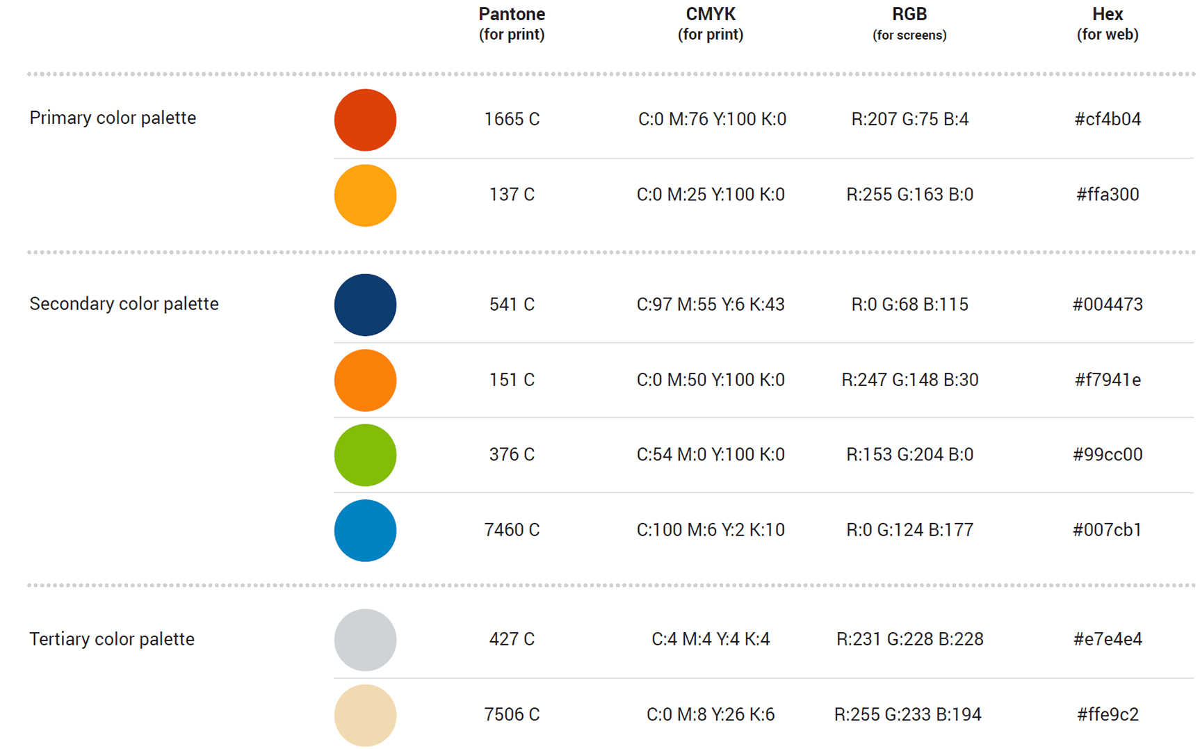
Our Colors

Our colors